A website built to get the phone ringing.
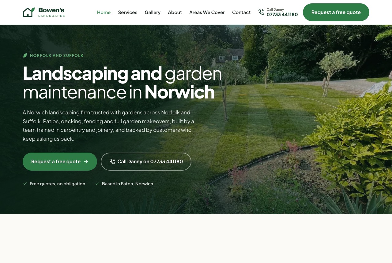
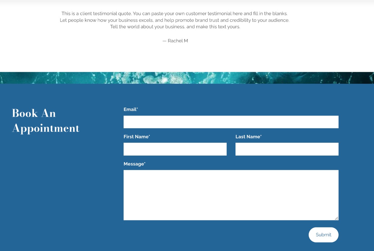
Bowen's Landscapes had a five-page builder template that looked like everyone else's and a quote form that may never have delivered a single message. We rebuilt it as 21 pages with its own identity, eight local area pages, and an enquiry route designed around how people actually get in touch.
The brief
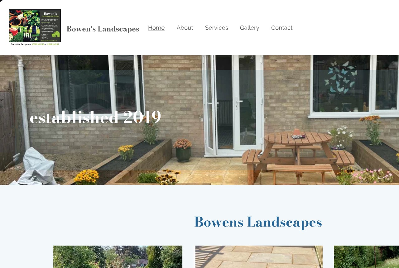
This client has run the business for years and gets most of his work by recommendation. The website was doing none of that job. It was a five-page builder template, indistinguishable from any other, with a browser tab that read www.bowenslandscapes.co.uk instead of a title and no route into the business other than a form.
The objectives were narrow and commercial. Look like a firm you would let into your garden. Turn visits into quote requests, calls and WhatsApp messages. Rank for the searches that actually happen around Norwich rather than vanity terms.
A design of its own
The old site used the template's typefaces, the template's blue, and a logo that was a photo collage with a phone number set too small to read. Nothing about it belonged to Bowen's specifically, which for a trade that gets hired on trust is the whole problem.
The rebuild has its own identity: a green drawn from the work itself, one typeface doing the whole job, and a full icon set generated from the mark so the services, area pages and quote steps all read as one thing rather than assorted clip art.
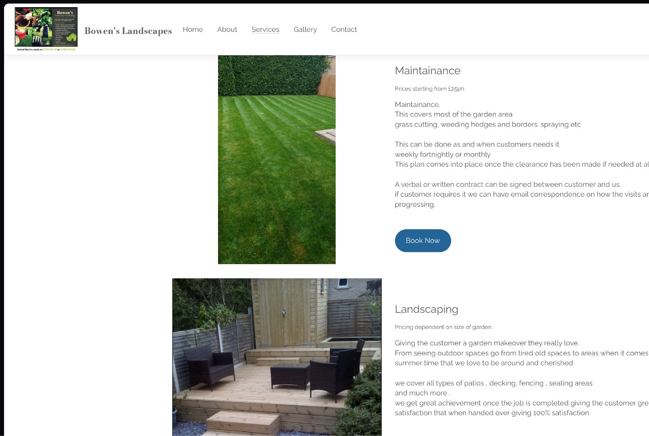
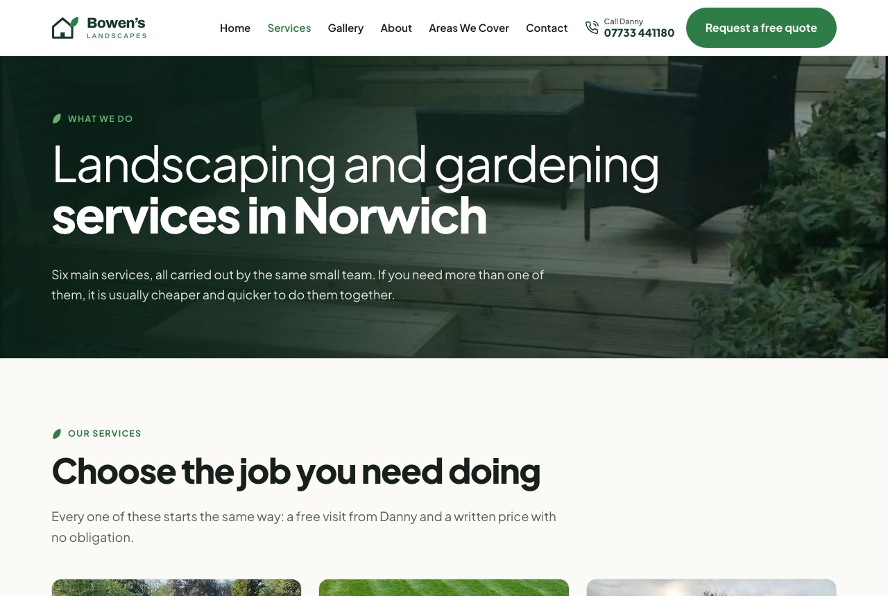
Every photograph on the site is the client's own work. Twenty-two of them, no stock, which for a landscaper is the difference between showing what you can do and showing what someone else's garden looks like. The old site had reused the same lawn photo three times on one page.
The enquiry route, which was broken
The old quote form may never have delivered a single message. No error, no bounce, nothing arriving anywhere: submissions were being swallowed before they ever left the page.
For a site whose only commercial purpose is producing enquiries, that is the whole thing failing quietly, and failing invisibly. Nobody complains about a form that appears to work. We found it during the rebuild, and it is the single most valuable thing the project turned up.
Then the form itself. The original asked for a required free-text message before anything could be sent, and composing a paragraph about your garden is the highest-effort thing you can ask of a stranger on a phone. It sat directly between the visitor and the only action the site exists to produce.
It is now three steps, tap first. Step one is nothing but tapping, so starting costs about two seconds, and personal details come last once somebody has already put effort in. The message box is optional, because the structured answers tell him more than a paragraph did. A form is also no longer the only way in: the phone number and WhatsApp sit in the header on every page, because plenty of people would rather just ring.
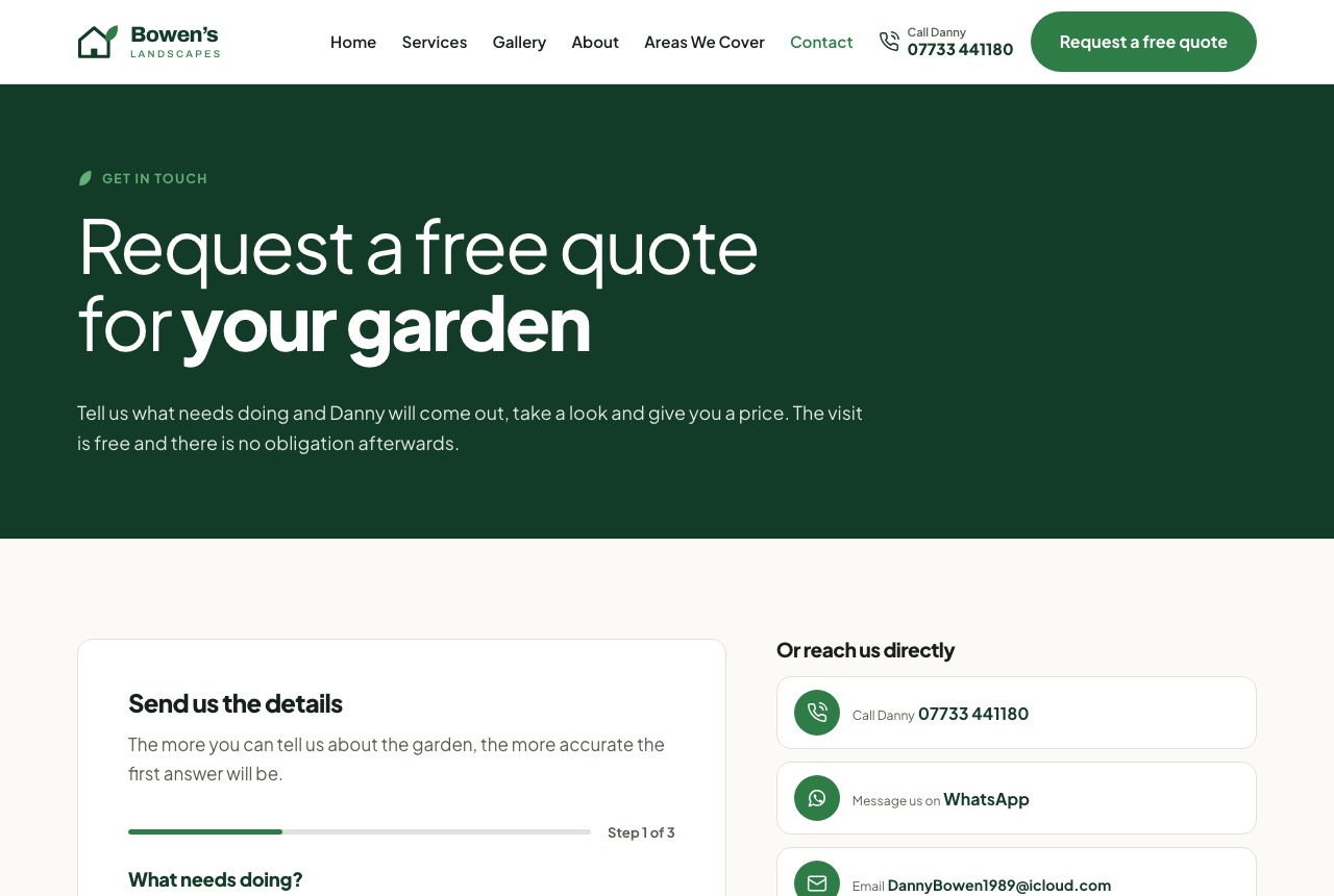
Photographs are the biggest lever on quote accuracy in landscaping, so the form takes them. Phone photos run 3 to 5MB each, which is heavy enough that attaching a few would have quietly failed at the final step. The form shrinks each image in the browser before it sends: a 2.9MB test photo came out at 315KB, a 9.2× reduction, which is the difference between the feature working and merely appearing to.
Local pages without the doorway trap
Eight area pages cover Norwich, Cringleford, Hethersett, Wymondham, Costessey, Horsford, Aylsham and Great Yarmouth.
The obvious way to build these is one template with the town name swapped, which is exactly the pattern Google's doorway guidance targets and which earns you one ranking page out of eight. Each page instead carries its own writing and differentiates on facts that can be checked: real distance from the yard in Eaton, postcode districts, genuine village names, honest travel policy.
Great Yarmouth talks about salt wind burning foliage and fences needing deeper posts. Horsford talks about sandy heathland soil and lawns browning in July. Aylsham talks about conservation areas and entries too narrow for a barrow. Different questions, not one answer reworded eight times.
The Norwich page deliberately does not target "landscaping Norwich". The homepage already holds that term and has all the authority, so a second page aimed at it would only split them. The area page targets district-level intent instead.
What the pre-launch audit found
A pass before launch turned up real defects rather than cosmetic ones. Three sections painted their own dark background without being listed in the rule that lightens eyebrow text, leaving it at 2.46:1 against a 4.5 requirement. The supplied favicon centred its glyph at 40% of the canvas, which renders a six-pixel house in a browser tab.
| At audit | At launch | |
|---|---|---|
| Worst colour contrast | 2.46:1 | 4.75:1 |
| Pages with over-length meta tags | 17 of 22 | 0 |
| Pages repeating a photograph | 12 | 0 |
| Homepage hero image weight | 1.9MB | 244KB |
| Favicon glyph, share of the icon | 40% | 72% |
Where it stands
A static build with no CMS to break, six service pages from a shared template, eight area pages from one route, LocalBusiness, Person, Service, BreadcrumbList and FAQPage schema, and consent-gated analytics alongside a cookieless tracker so the traffic numbers stay complete.
Nobody is at a desk
when the fence blows down.
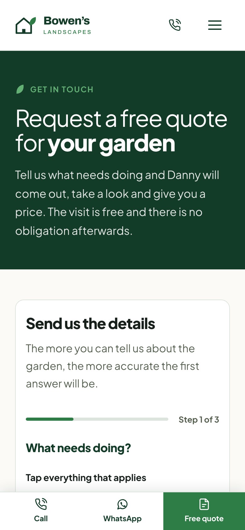
Garden work gets looked up on a phone, usually standing in the garden in question. So the mobile view is not a shrunken version of the desktop one, it is the version that had to work hardest.
A bar sits fixed to the bottom of every page with the three ways in: call, WhatsApp, or start a quote. Whatever someone is reading, the next step is already on screen.
- A fixed bar on every page, so the next step is never scrolled away
- Tap to call, in the bar and in the header, for anyone who would rather ring
- WhatsApp beside it, because plenty of people prefer to message
- Step one of the quote is tapping only, so starting costs about two seconds
- Photos attach straight from the camera roll, resized on the phone before sending
Soma Wellbeing Centre
A practitioner system that scales with the business.
Read it →Want something like this?
Tell us what you do and where your customers come from now. You'll get a straight answer on what would actually help, usually the same day.
- Priced on scope, agreed before we start
- Live in 10 to 14 days
- Norwich based, working UK wide